meal kit redesign
research / prototyping / testing
The design brief was to redesign the meal kits for a client in the food CPG space. The outcome was a next generation meal kit that reduces waste and facilitates waste reducing behaviors. This project was completed with four other Master’s students at the Industrial Design faculty at TU Delft. Our process is shared below.
discovery research
To immerse ourselves in the world of meal kits we conducted 15 participant ethnographies to observe and cook meals with participants, using meal kits on the market. We carefully recorded each action and identifiable micro and macro user emotion from planning a meal to storing it, which we mapped to construct a consumer journey (abridged below) and a Holistic Experience Scan. Our map revealed an emotional dip and design opportunity: Meal kit users were experiencing negative emotions attributed to the waste generated at the end of the consumer journey. They felt guilty about the amount of plastic waste to discard and disappointed that the meal kit required the partial use of perishable ingredients, such as tomato paste.
How might we…?
…reduce meal kit waste? Our team took this project beyond a packaging problem, to address both food and packaging waste, since food waste accounts for more than 50% of total meal kit waste by weight. A consumer survey revealed that ~70% of our target meal kit user population (millennials) were using meal kits as training tools which meant that meal kits were already positioned as educational tools. We saw this as an opportunity to use the meal kit as a vehicle to instill waste reducing behaviors in meal kit users.
A conjoint survey revealed that meal kit users appreciate that meal kits provide all the key ingredients essential to whip up a meal in 30 minutes or less with a large margin for error. To maintain the integrity of existing meal kits our design solution had to be failsafe, convenient and provide key ingredients. These “must-have’s” began to define the boundaries of our future concepts.
process
While I was involved throughout the design process, my main responsibilities were building and launching the research campaign (Discovery), facilitating workshops (Ideation) and planning and conducting usability testing (Embodiment).
After our 15 participant ethnographies, we conducted in-store intercepts and in-depth 1:1 interviews to further understand the meal kit user and refine our design goal.
IDEATION PART 1 (WORKSHOPS)
Once the design goal was more explicit we entered the Ideation phase, where research continued in the form of creative workshops with experts at the forefront of food innovation. We designed a series of creative exercises aimed to illustrate possible food futures and understand how the company wants to respond to these food futures.
IDEATION PART II (Analogies)
We looked for analogous sources of inspiration to understand how similar design challenges were tackled.
How does nature create create partitions to separate materials? The Answer: The amphiphilic property of water, and the principle that like attracts like, is responsible for the self assembly of water molecules into micelles or droplets that can serve as packets for cellular material.
How do organisms in nature protect themselves from foreign pathogens? The Answer: Many organisms - e.g. the white rock shell - secrete substances to coat themselves with antimicrobial properties.
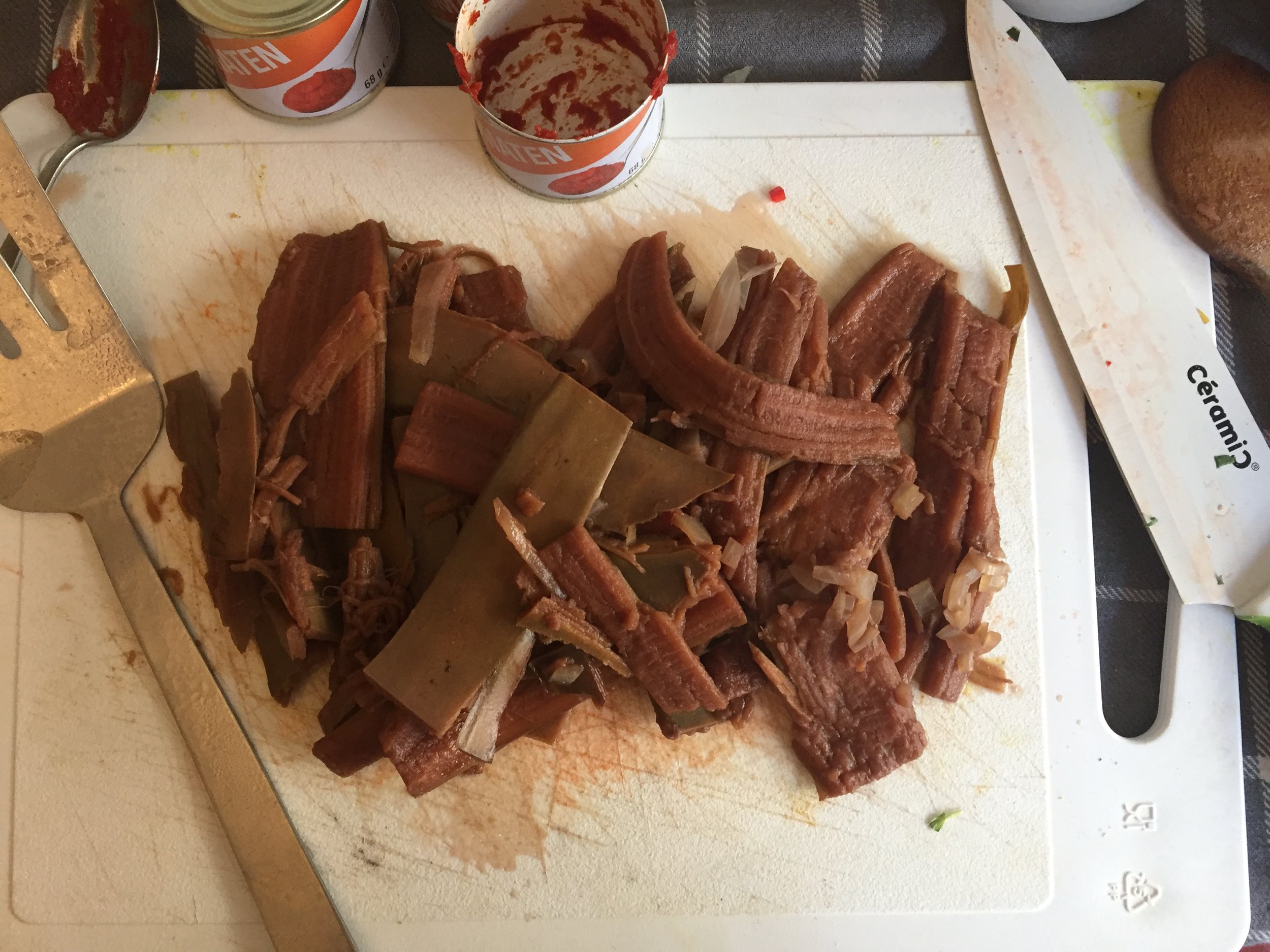
How can waste be redefined? The Answer: We found the answer in the Venezuelan food crisis. In the face of a beef shortage, Venezuelans were boiling discarded banana peels for hours to emulate the texture of beef and seasoning it to reengineer a traditional dish. Turns out, the bulk of a banana’s nutrition resides in the peel.
During the food crisis in Venezuela, banana peels were boiled for hours to achieve the texture of cooked meat and seasoned with spices before consumption.
HMW redefine waste to be food?
Micelles are microscopic, self-assembling droplets which rely on the amphiphilic properties of water molecules (polar head and a nonpolar tail).
HMW use the properties of H2O to create packaging?
The eggs of the white rock shell snail prevent microbial attack using a series of physical, mechanical and chemical defenses.
HMW protect and preserve the integrity of our ingredients?
Using the workshops and analogies above as creative fodder, we developed 3 “cooking practices,” each with its unique mechanism for eliminating food and/or packaging waste.
Hydrospheres eliminates the plastic packaging that encloses the dry ingredients in a meal kit. Instead dry ingredients are heated, dissolved, cooled and suspended in agar to create hydrophilic agar balls. These balls dissolve in medium to high heat within 60 seconds.
This meal is bananas! is based on the notion that everything can be consumed and nothing is waste. We developed three recipes, putting stems, peels and seeds at the center of each recipe. (On the right) Banana peels are boiled to simulate the texture of beef, inspired by Venezuelan practices during times of food shortage.
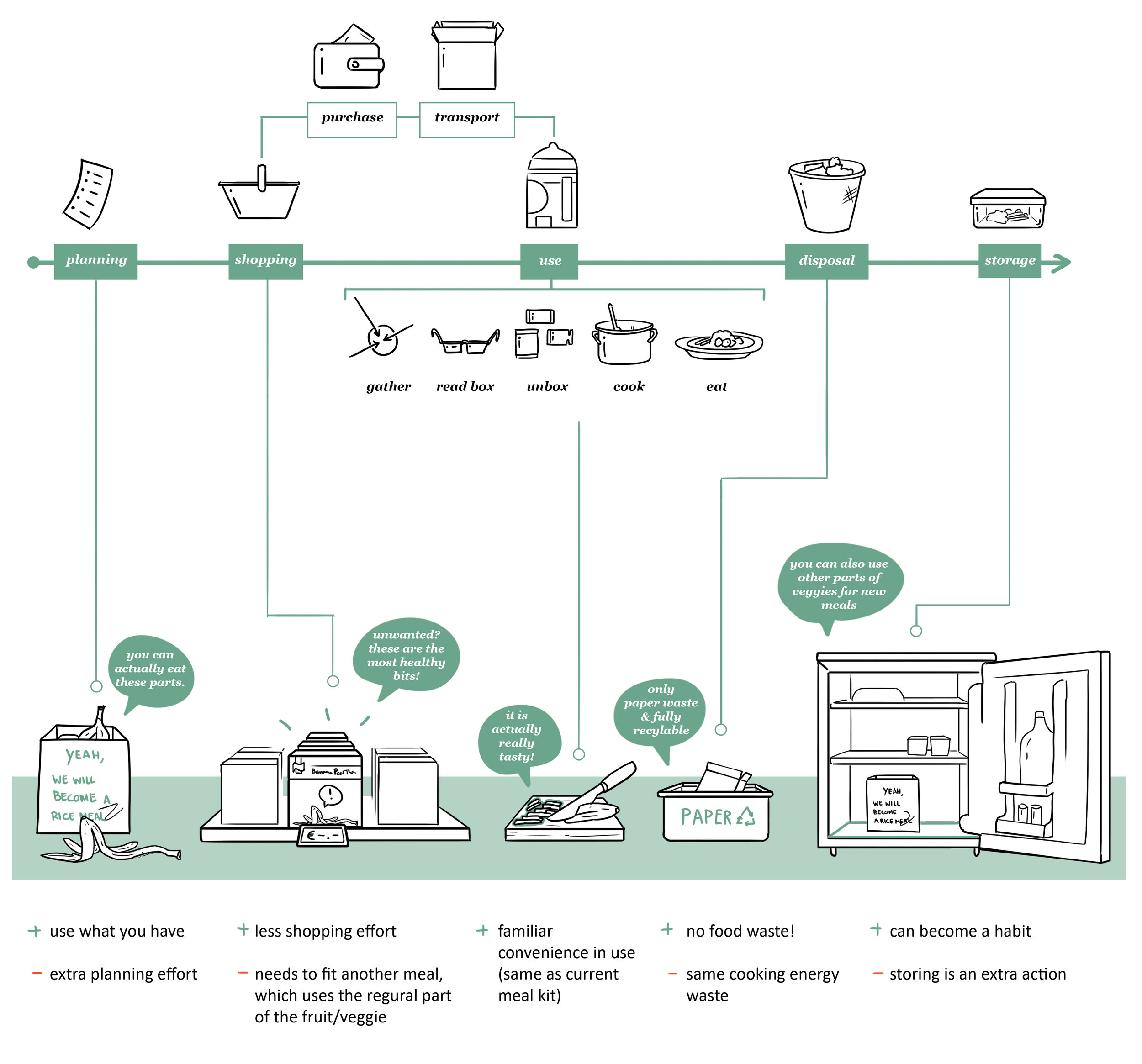
Leftovers also relies on waste, storing scraps, peels and seeds from a first meal, in a biodegradable teabag, which are boiled to extract flavor for a second meal. This practice became the kernel of our final solution concept.
Each cooking practice gave rise to a new meal kit interaction mapped below.


design Criteria
Finally each cooking practice was ranked on its ability to address our design goal.


The Leftovers concept was chosen The premise behind this concept was that all the waste from the first meal - seeds, peels, leftover ingredients - get utilized in one way or another in a second soup-based meal. We developed 3 recipe combinations with in-house company chefs: Indian Tikka Masala paired with a spiced yogurt soup, Thai Green Curry paired with a Thai chicken coconut soup and Mexican Enchiladas paired with a Broccoli cheese and chicken and rice soup.
embodiment
We were ready to explore packaging solutions for Leftovers. We prototyped with different materials and form factors, and downselected to the following three solutions based on the same criteria (above) used to evaluate the cooking practices.
Because of its ability to deliver an easy, frictionless user flow, we chose the ‘Wallet’. Each ingredient was encased in vellum paper coated with a nominal amount of plastic on the interior to protect the integrity of the ingredients. At each step of the cooking process the user would be prompted to tear off the next relevant ingredient, guiding them through the process in a linear, stepwise fashion.
Usability
Overall the user experience was poor and left consumers feeling restricted by the linearity of the instructions, anxious about losing steps and confused about the function of the broth bag - critical for the second recipe.
Next steps
We presented the results of all three phases of product development to make a recommendation to the client’s R&D department. We highlighted our reservations with the existing form factor and made recommendations for future iterations of the package based on the results of our usability tests.


